Logos
Logos are made with icons, so the Logos are combination of Icons and
because of that they carry more information than the Icons. Logos represent an
organization that can be a company, a business, etc.
|

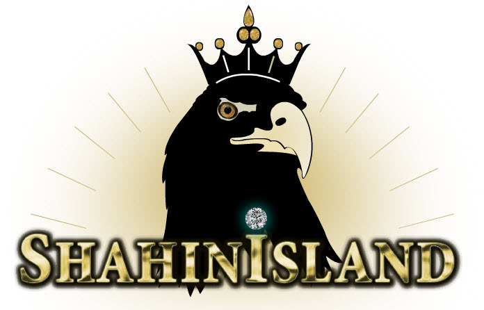
Logo design with type
The name of the font that I used in this logo is "Broadway". here I did resize the "E" and rotate it then I place it on the "Spine" of the "S" to create the "overlaping", one of the other reason that I chose this "S" is becouse of the curve strokes "Tail" of it that will give the logo some "Movement". The color harmony here is "Monochromatic" because: the color that I used here are from similar hue with different Brightness and Saturation.
|
Logo design with type
On this logo I started with "French Script MT" font, and then by connecting the "S" and "e" I made a "Ligature" to create a bird to make it a "lettermark" logo. The color harmony in this logo is "Monochromatic" since is blue with the different saturation and brightness. The balance here is Asymmetrical and you can also see the movement.
|
|
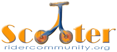
Logo design based on the "lettermark"
The font that I used in this logo is "Broadway". I like this font for this logo because of the "Ear" of the "R" at the end that it will add the "Movement" that I need since is a "scooter" logo. The color harmony here is "Complementary" as you can tell the color that I used here are from different hue with different Brightness and Saturation but they are tow complementary colors since there column numbers are differ by 6 on the color wheel. There is high saturated Orange and high saturated blue. I try to use the "scooter wheels" as symbols for letter "O", so when you look at the logo visually you are able to get some idea and when you read the text you will see the "Relationship" between the image and the text. and the text that I used at the bottom is "Century Gothic" that I believe is a " Sans Serif" font, since there is no "Serif" sign on the corners of the letters.
|
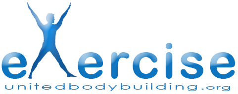
Logo design based on the "lettermark"
The font that I used in this logo is "Arial Rounded MT Bold" that is a "Sans Serif" font and there is a "relationship" between this font and the font at the bottom of the logo that is "Century Gothic" another "Sans Serif" font. One of the reason that I choose this font was because of the "Eye of Counter" of "e" that will be a good reason for the viewers eye to stop on this logo. The color harmony here is "Monochromatic". All the color is from one column of the color wheel with differing of the saturation and brightness. In this logo as you see the "Man" on a exercise position is showing as a symbols for the letter "X" with the "Relationship" between the text and the image,
|
|
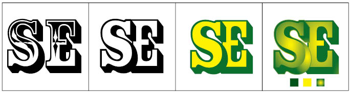 |
Logo design with type
The font that I used in this logo is "Rosewood STD" and it can be a serif font since there is serif used on the letters. by adding gradian color the "Shoulder" of "S" I try to move the viewer's eye smoutly to the letter "E" that it carry the same gradiant. The color harmony here is "Analogous" as you can tell the color that I used here are from different hue with different Brightness and Saturation, there is high saturated green, low saturated green, high saturated yellow and more color that they are all created out of Green and Yellow.
|
|